
Note: This article is for the newly redesigned module. This updated module is in the process of being rolled out and may only be available to some users.
Overview
In this article, you will find detailed instructions on how to configure your Community Display settings in BuildingLink. This software functionality allows you to showcase information such as packages, important building announcements, photos, current weather, train schedules, calendar events, and more on a monitor placed in a common area of your building (typically the lobby or mailroom where residents can view it.)
You can also watch our Community Display Webinar to learn more.
Note: Click on the images to enlarge them.
Table of Contents
- Examples of a Community Display
- Community Display Requirements
- Community Display Settings
- Creating and Launching a Community Display
- Community Display Customization Page Settings
- Customizing a Community Display
- Adding and Adjusting Display Widgets
- Removing a Widget From the Display
- Amenity Reservations
- Announcements
- Banner
- Calendar Events
- Date & Time
- Flyers & Photos
- Header
- News Feed (RSS)
- Open Events Grid
- QR Code
- Rideshare
- Transit
- Video
- Weather
Examples of a Community Display
Package Focus

Amenities Focus

Complex

Community Display Requirements
What hardware is necessary for a Community Display?
The Community Display requires a monitor (this is usually a large flat-screen television), a PC, and an Internet connection.
WE DO NOT RECOMMEND SMART TVs.The built-in web browsers on Smart TVs are not supported for accessing BuildingLink.
- TV/Monitor (Required): Any TV/monitor with the necessary inputs for your PC will be good enough. For Community Display purposes, they all perform about the same, with the main difference being the size/appearance of the display.
- Recommended TV/Monitor Specs: We usually recommend a 32" TV as a general starting point if it is wall-mounted, but a larger TV may be desired. For displays smaller than 32", we suggest using a PC monitor rather than a TV.
- Minimum Recommended PC Specs: Intel Celeron or i Series, 8GB of RAM, Windows 10 or later.
- Recommended PC Specs (Updated 3/2025): MINIX NEO J51-C8 Max Mini Computer
- Recommended Internet Browsers: Our Community Display currently only runs on supported browsers (Edge, Chrome, Firefox, Safari) and is optimized to run best in Google Chrome.
Community Display Restrictions
- TVs with built-in web browsers are not supported, and wireless video connections are not recommended, as they may lead to buffering.
- We do not recommend mounting a TV or monitor sideways (vertically). At the same time, it may save a few inches in space, but it can be difficult to properly manipulate vertical displays on PCs, resulting in frustration when setting up the display, and when troubleshooting may be necessary.
Can we purchase the hardware from BuildingLink?
Unfortunately, BuildingLink does not sell TVs, Monitors, or PCs. We only provide recommendations.
Does the Community Display monitor need a dedicated PC?
We highly recommend that Community Displays be run from a dedicated PC. Please refrain from running Community Displays on PCs that are shared between staff and/or security software, as this can cause interruptions in the display.
Display Inconsistencies
Depending on screen resolution settings, your Community Display may look different on your monitor from the device you configure it on. Contrast in the output display's resolution can result in the content being stretched, truncated, off-screen, or resized.
If this is your building's initial setup of the Community Display, we recommend that you launch the Community Display on the same monitor that's connected to your dedicated PC, fine-tuning the display settings for the desired resolution and size.

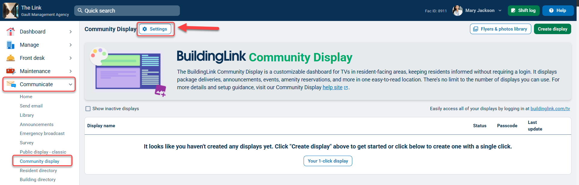
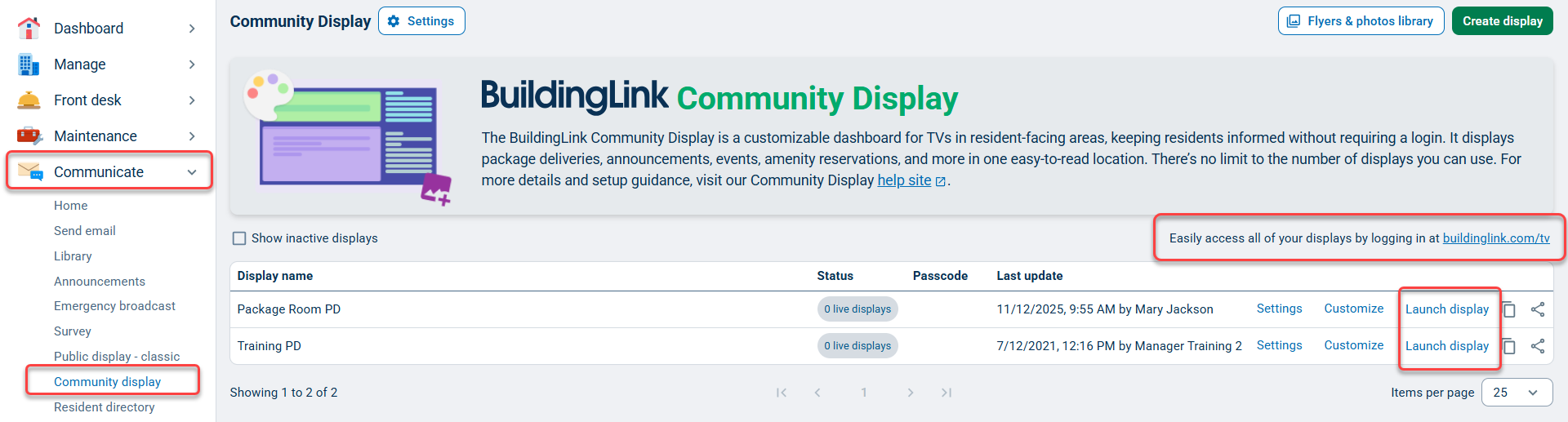
Community Display Settings
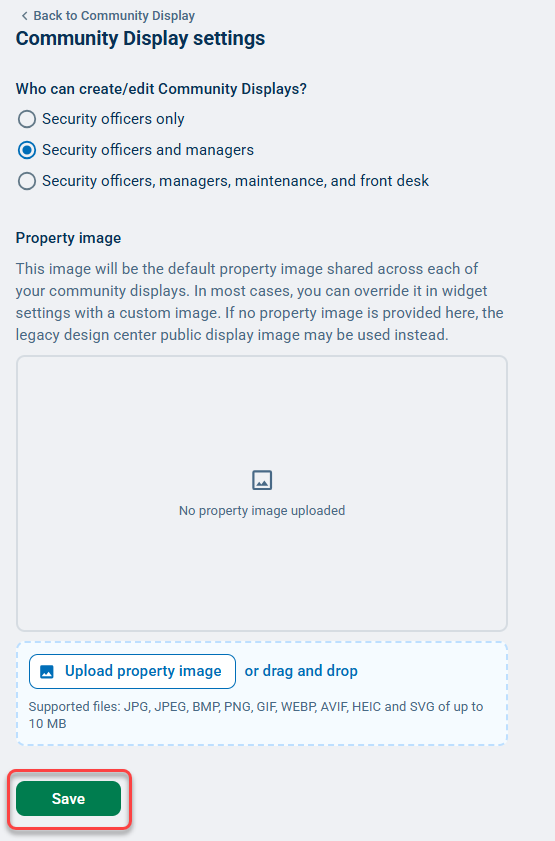
By default, only Security Officer users can add or edit a Community Display, but you can allow other staff access by changing your Community Display Settings. To do so, go to the Communicate tab, select Community display, click Settings, then choose who you want to have access. You can also set a default property image for all your Community Displays here. Remember to save your changes.
Creating and Launching a Community Display
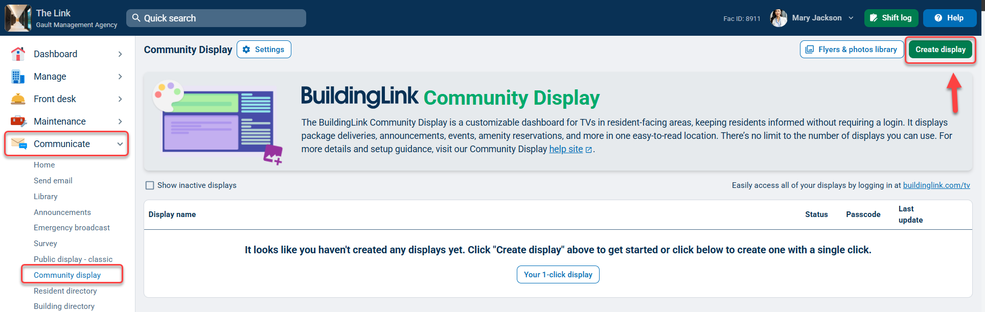
To create your Community Display, go to the Communicate tab and select Community display. From here, if you don't have any active displays, you can use Your 1-click display option to have a display automatically created for you (see video below).
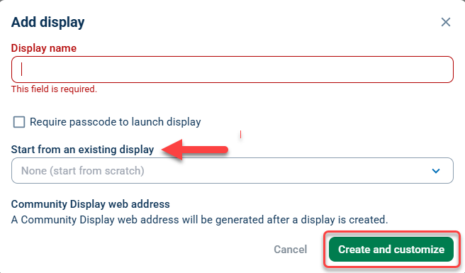
You can also create a Community Display manually by clicking Create display. This will open a new window, allowing you to set your display name, passcode, and choose to clone an existing display as a starting point. Once you've named your display and set your settings, click Create and customize to open the display customization page.
To launch an existing display, click Launch display on its row. Note: You can easily access all of your Community Displays by clicking on the buildinglink.com/tv.
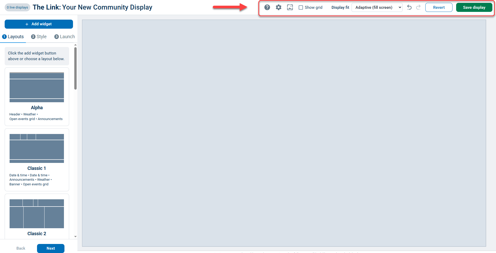
Community Display Customization Page Settings
On the top of the page, you will be able to reference the following additional tools to help set up your Community Display:
- Help: This will provide access to our step-by-step quick start guide, help site, Widget Controls, and Keyboard shortcuts. You can submit any feedback about the display by clicking Let us know!
- Settings: This will allow you to customize your Display name, set password requirements, set Active/Inactive statuses, and copy your Community Display web address. To save any changes, click Save.
- Fullscreen slideshow settings: Allows you to display information on your Community Display as full-screen slideshows. If you want to display announcements as full-screen slideshows, select Display announcements as full-screen slideshow and then click Apply.
- Show grid: Enables a grid overlay to appear when customizing your display. This can be helpful for establishing your display's composition and layout. To disable the grid, click on Show grid again.
- Display fit: Allows you to choose a screen size that supports 16:9, 16:10, 4:3, 3:2, 21:9, 32:9, 1:1, 9:16 screen ratios, which means the fixed preview is precisely what you'll see when launched. All curated layouts default to adaptive 16:9, which means widgets are responsive, but what you see in the editor isn't exactly what you'll see on a larger screen.
- Undo: Allows you to undo granular changes while editing a display.
- Redo: Allows you to redo granular changes while editing a display.
- Revert: This will discard your display edits and return it to the last save.
- Save display: Allows you to save your current display.
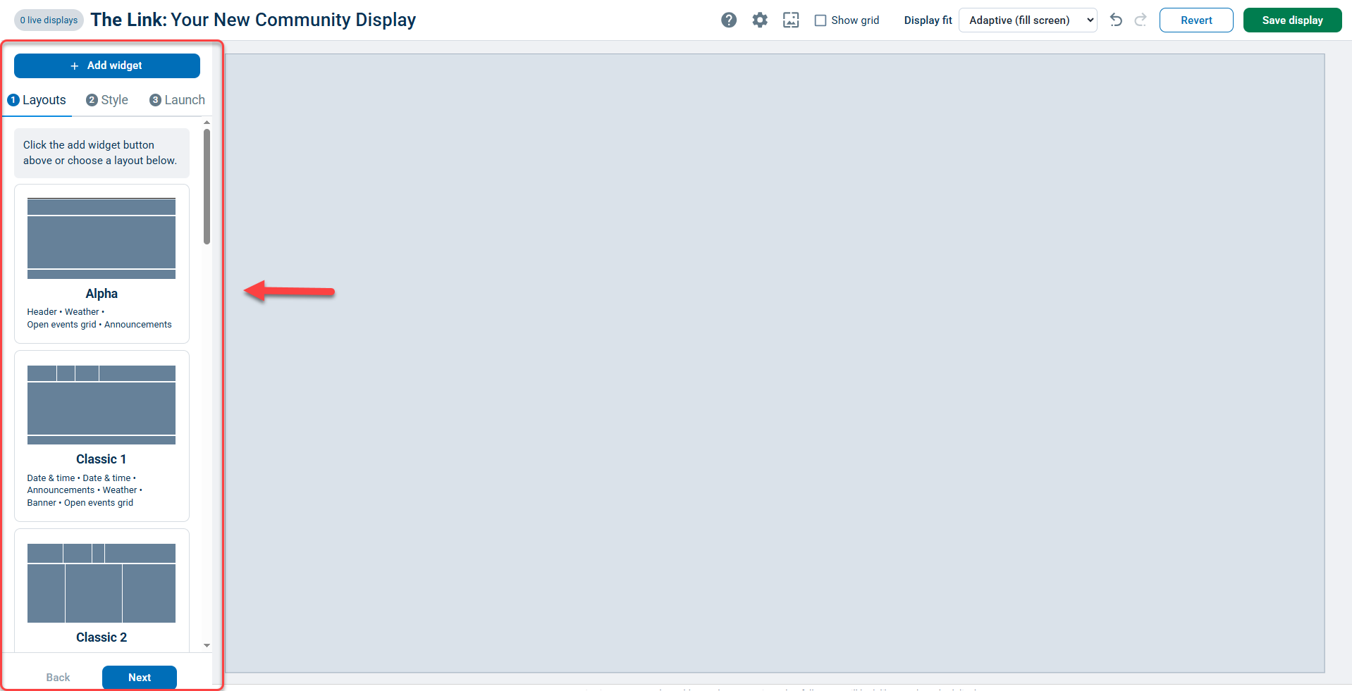
Customizing a Community Display
At the center of your Community Display dashboard will be a step-by-step guide on how you can configure and launch your display.
On the left panel will be the customization options associated with each step of this setup guide.
Layouts
Under the Layouts section will be a list of pre-set dashboards that you can choose from to set as the basis for your Community display.
When selecting a layout, a preview of it will render in your dashboard. After you've selected the layout that you want, click Next.

Style
Under the Style section, you will be able to apply either a curated theme or create a custom theme for your Community display. Included below are the available style settings:
- Widget accent color: Allows you to set the accent color for your widgets.
- Widget background color: Allows you to set the background color for your widgets.
- Widget background transparency: Allows you to increase/decrease the transparency of your background image.
- Widget corner rounding: Allows you to style how rounded or sharpened the corners of your widgets are.
- Widget spacing: Allows you to stylize how much spacing should be added to your widgets.
- Font color: Allows you to control the font text color of your widgets.
- Display background color: Allows you to set a background color for your Community display. If you have a background image uploaded, no background color changes will be visible.
- Display Background Image: Allows you to either use a pre-set background image, upload your own image, or search for a stock image. To remove a background image, click Remove background image.
- Background image contrast: Allows you to control the degree of contrast for your background image (this setting only appears after choosing a display background image) .
Note: You can use a curated theme as a base style template, then apply further customizations to your Community display as needed in the Customize section.
To apply a curated theme, click on one of the styling options under Themes.

To apply a custom theme, scroll down to the Customize section and select the styling options that you want to apply to your layout.

Launch
Under the Launch section, you will be able to finalize your display for launch. To complete this step, click Save and launch display.
You can also share your Community Display by clicking on the Share display URL icon, which will open a window with recipients you can share your URL with.
If you want to copy the URL, click on the Copy display URL icon.
Note: If you have any questions concerning your Community Display, you can reference the list of FAQs for helpful information.

Adding and Adjusting Display Widgets
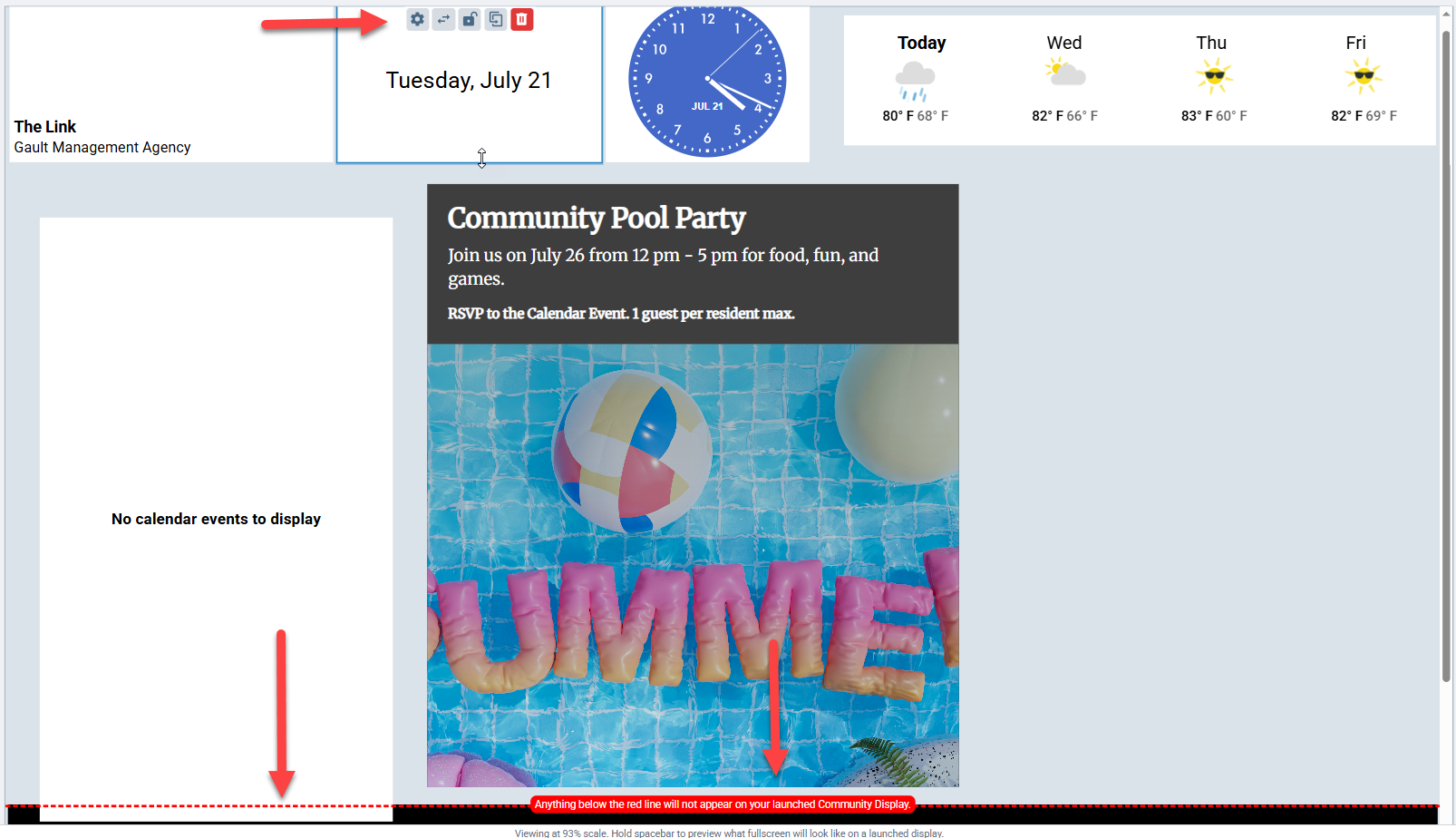
To add a widget, click on the +Add widget button.
Then select the widget that you want to add from the Add widget window.
The widget will then appear on your Community display preview. Click and hold to drag the widget where you’d like to place it. Note: Any widgets placed below the red line will not appear on your launched Community Display.
To adjust the size of the widget, click and drag on any corner or side. Click on the Widget settings icon to change the widget content. You will also see options to switch to a different widget type (swap) or duplicate a widget.

Below is the list of Widgets currently available at this time:


Removing a Widget From the Display
To remove a widget from the display, hover over the widget and click on the Delete widget icon. When making any changes to the Community display, be sure to click the Save display button before closing the page or logging out.

Amenity Reservations
The Amenity reservations widget displays upcoming approved amenity reservations.
Listed below are the current available Amenity reservation settings:
- Maximum number of days to display: A drop-down menu that allows you to set the maximum number of days that will be displayed on your amenities widget.
- Maximum Number of amenities to display: A drop-down menu that allows you to set the maximum number of amenities that will be displayed on your amenities widget.
- Amenities to include: A list of available amenities that can be enabled/disabled from the Amenities widget. Enabled reservations will be displayed on the amenities widget, whereas disabled events will not be displayed


Announcements
The Announcements widget allows you to display announcements you've created within the Management site (customizable from the Active announcements section on the Dashboard). Listed below are the current available Announcement settings:
- Announcement type: Allows you to select one or more of the following Announcement types to be enabled/disabled on the Announcements widget: Text-only, Template, or PDF/Image.
- Carousel interval: By default, announcements are only set to rotate in and out (carousel mode). You can customize the rotation interval within Announcement settings by clicking on the drop-down menu for Carousel interval.
- Background color: Allows you to select whether the background color of your widget will default to your pre-selected background color or black.
Select your preferred settings and then click Apply to save changes.
Click here to learn more about the updated Announcement module.


Banner
The Banner widget displays your property name, property image, management company name, and site URL.
By default, the Banner widget will display the property image listed on Website Building Images under the Design center module. If you don't see a default property image or would like to change it, you can upload one in the Community Display settings
To upload a different image, click Custom Image, then click Upload Image, select the desired image file from your PC, then click Apply to save changes.


Calendar Events
The Calendar events widget can display upcoming events you've entered into the Building Calendar under the Management tab. Listed below are the current available Calendar settings:
- Maximum number of days to display: A drop-down menu that allows you to set the maximum number of days that will be displayed on your calendar widget.
- Maximum number of event to display: A drop-down menu that allows you to set the maximum number of events that will be displayed on your calendar widget.
- Categories to include: A list of available Calendar categories that can be enabled/disabled from the Calendar widget. Enabled events will be displayed on the calendar widget, whereas disabled events will not be displayed.


Date & Time
The Date & Time widget will allow you to customize the display of your date and time widget. Listed below are the current available Date & Time settings:
- Format: Controls the display of both date and time information, or just one.
- Date & time layout: Controls whether date information should be displayed as stacked (auto), centered, or spread out.
- Date format: Controls whether date information should be displayed in long (day, date, and time) or short format (date and time).
- 24-hour clock: Controls whether the count time will be set from 0 to 23 or 1 to 12.
- Show seconds: Controls whether seconds will be displayed on the time display.
- Analog clock: Controls whether a digital or analog time display will be set.


Flyers & Photos
The Flyers & Photos widget allows you to customize a slideshow of your property's flyers/photos for display. Your slideshow playlist can contain a maximum of 60 slideshows.

Header
The Header widget enables you to set up a header (located at the top of the display) or footer element (located at the bottom of the display) to showcase information such as date and time, custom text, property image, and property name.


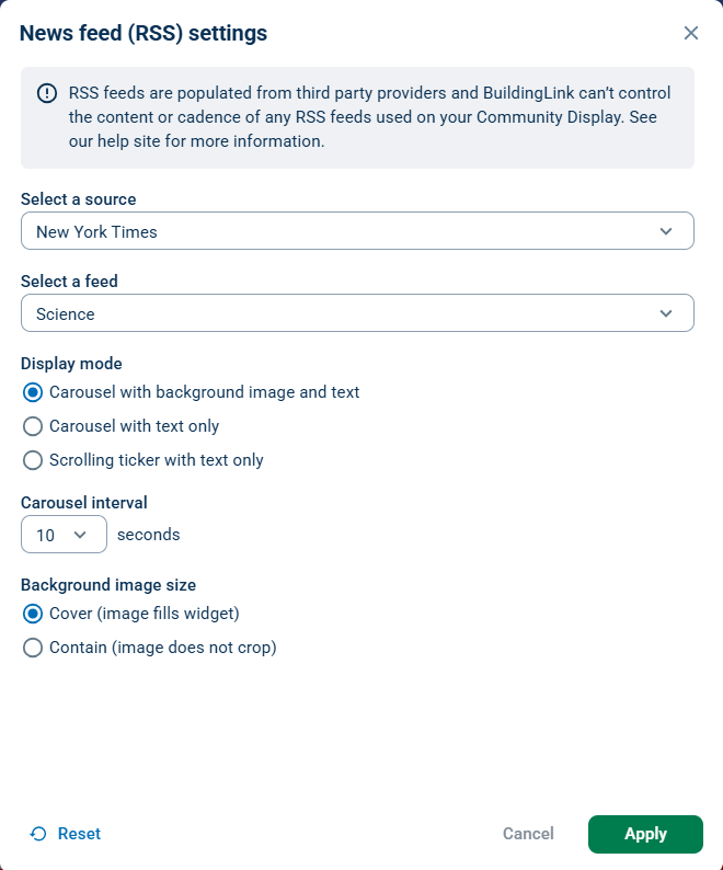
News Feed (RSS)
This News feed (RSS) widget allows you to display an RSS feed. Included below is the current source list available:
- Australia
- BBC
- CBC
- ESPN
- Fun
- Marketwatch
- NASA
- New York Times
- Wall Street Journal
- Washington Post
- Custom RSS Feed
To select a source, click the dropdown menu for Select a source and choose your RSS feed.
To set up a custom RSS feed, click Custom RSS feed, enter the URL for your RSS source, add a title, apply any styling changes under Display mode, Carousel interval, and Background image size, then click Apply to save the changes.

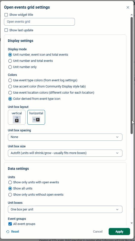
Open Events Grid
The Open events grid widget displays the deliveries a unit has recorded in the Event Log. Listed below are the available Open events grid settings:
- Display settings
- Display mode: Determines how your Events grid data should be displayed.
- Colors: Determines how the color preferences for your Events grid data should be displayed.
- Unit box layout: Determines the vertical or horizontal positioning of your Events grid icons.
- Unit spacing: Determines the amount of spacing to add to your Events grid icons.
- Unit box size: Determines the size of your Events grid icons.
- Data settings
- Units: Determines which units should be shown on your Events grid.
- Unit boxes: Determines how your units and Event types-related data should be displayed.
- Event groups: Determines which event groups should be displayed on the Events grid.
- Event location shown: Determines which locations should be displayed on the Events grid.
- Unit name keywords to filter: Determines which units should be filtered from the Events grid display. This can be helpful in creating Event grids that exclude commercial or retail units, test units, and management units.

QR Code
The QR code widget lets your residents scan a QR code to download the mobile resident app or access TippingLink on their mobile devices. You can also create custom QR codes for your property.
To customize your QR widget, click Widget settings. Click Apply to save changes.


Rideshare
The Rideshare widget displays the ETA of when an Uber will reach the property.


Transit
The Transit widget will display the status of the Metro system you select. At this time, the Metro Systems we support are as follows:
- CTA
- MTA
- WMATA


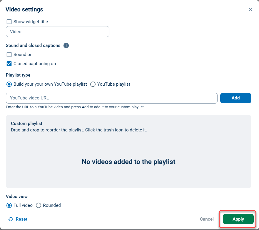
Video
The Video widget allows you to stream a YouTube playlist or create your own custom playlist by adding each video's URL.
Weather
The Weather widget allows for the display of weather info based on the zip code of your property.

